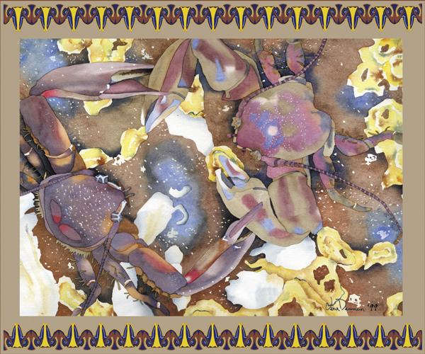
IMAGE AND TEXT ARE BOTH COPYRIGHT PROTECTED
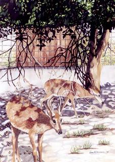
"WHITE TAILED DEER"--20"x28" original Watercolor Painting by Vera Dennen
So almost a week has flown away, and with it my determination to blog at least three times a week. Have to admit right here and now that it
never will happen!!!
But I do want to continue my look into gray. An artist friend of mine, after recently reading Set 1 on gray, had this to say . . .
“...I find I use grey more and more as I understand it better and I too used to avoid it! Ha! Maybe now with grey hair and everything else happening, we have made friends with the color!” I think she may have a point. And what is really so strange is that gray is no big mystery at all: mix any variation or intensity of the three primary colors and you will have produced some shade of gray. What took it so long to sink in?
The
nonstaining triad is one of my favorites. Aureolin, rose madder genuine, and cobalt blue can be combined in equal amounts of altering proportions of each. Grays made with these pigments will have a great transparent, luminous quality, perfect for glazes. You can create wonderful atmospheric effects in your paintings without creating a
heavy background, or modify the intensity of an underlying color. Try adding a small amount of any fourth pigment with this transparent blend. For example, make your fourth addition a small amount of
brighter pigment you plan to use in the painting--the mixture that would normally be discarded as
muddy can now be used to accentuate that much brighter hue.
Predictably, the mixing of the
staining triad will work in reverse; Winsor yellow, Winsor red, and Winsor blue can also be mixed to make gray (along with any other combination of staining primary’s). These neutrals dry lighter and with less intensity than they would appear to have as wet pigment, so be careful when first becoming acquainted. They are wonderful for use as middle values, but tend to take over completely if used as a glaze. You can mix your own version of Payne’s Gray, Sepia, etc. with the staining triad, so be aware and do not plan to use this gray in any way you would not use a deeper toned premix.
And finally, we come to opaque. Yellow, Indian Red, Cerulean Blue are some examples of the
opaque triad that you might use, although there are certainly others. An opaque neutral, although being made-up of pigments I normally do not find beneficial, takes on a richness and consistency that is especially useful while a broad assortment of darks can be produced. I find myself mixing a batch of opaque gray for use in landscapes, animal fur, and places I will be adding short, quick brush stokes such as building rocks or rocky terrain. However, large areas of this triad can quickly be overdone, appearing muddy, or boring in scope.
So there you go! Neutrals can be a lifesaver if you become aware of individual properties and where they are weak. In the painting above, “White Tailed Deer”, I have extensively used several triad mixtures to my advantage: an opaque triad in the trees, with non-staining pigments on the ground as a glaze, and another neutral for highlighting fur. There may be a fourth combination mixed in there somewhere as well, I don’t quite remember, but I do remember having fun . . .
* Artist's, if you would like to receive a list of pigment properties for mixing a varity of triad's, please contact me through my web site. I will happy to sent one in return.