3/21/06

Installment#9: MY SECOND ACRYLIC

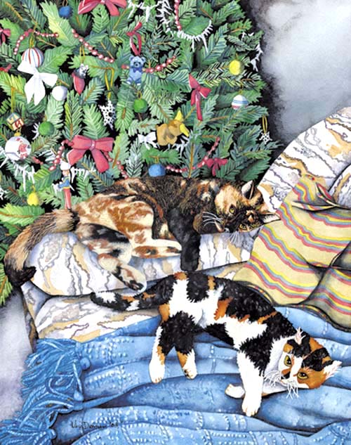
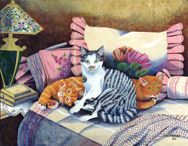
HOME AT LAST! 22"x 28" 2006


No, I am not planning to laboriously show each and every painting as it's produced. In fact you may correctly deduce that, since this post is dated in March, and the previous one had been in January, there may have been one or two, or three (okay, probably more like four) paintings developed and completed between. However, there are some areas pertaining to this watercolor-style-acrylic painting I would like to point out.

First of all, notice how nicely the flowers on pillows tuck neatly behind the cat bodies. No big deal right . . . Right. No, I really am serious; there is no trick to that part at all! But, the wonderfully transparent blue-grey glazing applied over the flowers is what I want you to see. Until experimenting for myself, I would never have believed such a sheer luminous passage (easy with transparent watercolor), could be accomplished with acrylic as well. Looking further over the painting, I hope you will notice many more places where this type of glazing and shading were used; usually in areas of shadow.


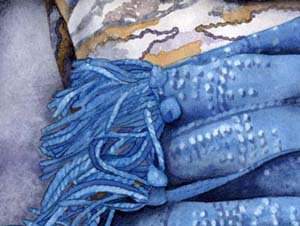
In this second image, besides getting a good look at my favorite cat friend, I hope you can see the grainy surface in the upper left hand corner. The paper grain has been enlarged here as well. The use of watercolor paper, in this case Arches Cold Press 140 lbs., is largely the reason for any ease of handling. When being used over a gesso, I have not found that same willingness to glaze and blend that acrylics have when used with paper.

I hope by showing these paintings some of you will want to give acrylics a try. They truly have several advantages over watercolor not readily apparent. One is the ability to freely use mask without disturbing any color below. For instance, I found mask very handy when moving from light colored pillow fabric into the much darker background, still keeping a clean line. Something I would not have done if using watercolor for fear of leaving a pale line where mask was removed. Yet, to the busy artist, this ease of movement can offer a significant advantage.

And acrylics do not have the correction limitations of traditional watercolors. In the previous post I mentioned the many tries needed to repaint one specific area of "PLEASE" before finding the right look. Well, there wasn't anything quite as drastic with this painting, but there were a few areas of fur in need of corrections on the black and white cat. We all know what removing black paint would have involved if working with watercolor. All of the carefully dampened areas and repeated brushing of the dark painted paper until the entire top layer comes up. . . Sounds brutal even to type!

Acrylic requires only a few brushes full of white gesso to hide the offending black paint. . . Let the fresh gesso dry, then finish your corrections where needed.

1/16/06

Installment#8: My First Acrylic

PLEASE!

No, I have not fallen over a cliff, although almost! Was ill during time of my lapse in posting, and did spend some time in the hospital. However, am feeling fine and fit now, so . . . no more excuses!

While I have never been a fan of acrylics one thing turning my decision toward giving them a try was seeing wonderful luminous work pouring from an artist friend of mine on a regular basis. I was stunned! His were not flat and lifeless as I had always seen from Acrylic paintings. His even possessing depth and luminosity, possible only when the most transparent of pigments have been employed.

I began to get excited.

One of my early frustrations with acrylic once I made the decision to try was the difficulty in figuring out how to fade and to blend. In other words, I had been led to believe acrylics could be used much as watercolor. After some trial and error (and a fair amount of hair pulling) it all worked out as I had hoped. When I began to think of Acrylic as a heavier bodied watercolor it helped.

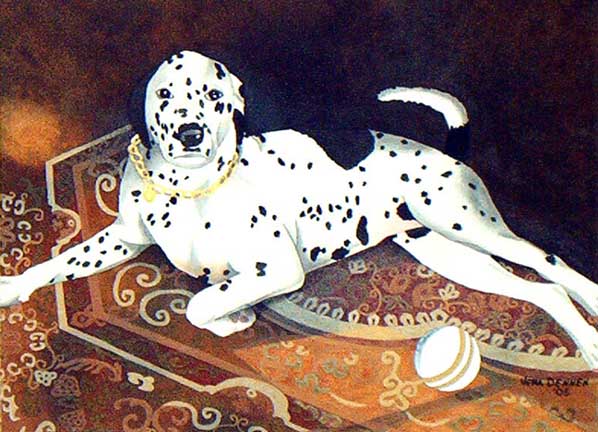
The truth is it took me several tries to get the portion of rug lit by sunlight looking natural, i.e. more faded in color where sun was hitting the fiber. Had to cover that area with gesso not once, but twice, and completely start over!! Each start-over took at least three coats of gesso to cover-up the color beneath. However. . . the nice thing about acrylics is that I could!


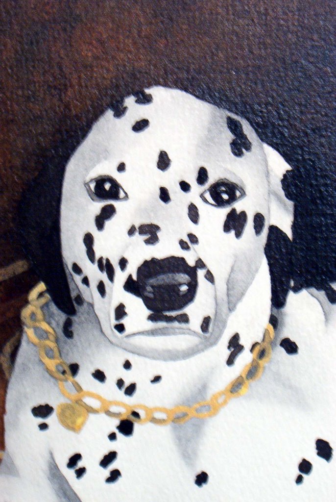
Although it is more obvious on one side than the other, and hard to see in a small image, there is definition between Dalmatian's head and the dark background. Hope this close-up helps somewhat.

Would you believe that except for the Titanium Buff used in the rug, which is obvious, all other shades were produced exclusively with mixes of Ultramarine Blue & Burnt Sienna, both of which are transparent. Four color palette: U.Blue, B.Sienna, T.Buff, & Ivory Black. A touch gesso was used for toning a small amount of black into grey, plus white of the paper. However, there are at least six to seven totally different shade mixes of U.Blue & B.Sienna.

This artist further discovered that, for me, it was the final medium glaze which actually made the colors so rich, giving the painting more depth than I could ever have hoped.

I am excited a-new!!!!

8/15/05

Installment#7: LEARNING OIL PAINTING

This is a continuation page from postings on artcafe.com my favorite place for artist-to-artist chat,
(where you can read all of the questions and answers, as well as follow my progress of learning to paint in Oils)

Answering a Question from Jane Freeman:
Q: Do you have Jane Jones book?

A: Yes Ma'am I do, as does Doris, which is why she asked me to post these progressive steps as I go. Plus there is a wonderful story that goes along with the purchase of this book, if anyone would care to read it. Had just picked up any old book off of the bookrack to begin with that had Oil on the cover, in order to page through for what type of supplies I would need. Only wanted to begin trying Oils for myself. I just had not found any example of what I was hoping to do, so thought I would try figuring my way through. Anyway, as I read a paragraph or two, she was talking about luminous colors, transparent and opaque, building by layers and all of the things that I had always loved watercolor for! I could not put it down.

So I bought the book rather then any supplies and just went home where I read that book cover to cover, twice! By that time I was so excited and impressed with what I had just read, I emailed her to tell her that not since Arleta Pech had a book touched me so deeply. And you know what? She emailed me right back to ask if I had known that Arleta Pech, whom Jane Jones calls the Godmother of her book project, had not only talked her into writing the book to begin with but guided her all the way through!!! Can you believe that? I was bowled over!

Since then I have asked her a question of two, but her book is so complete that before she can answer me back I have dug out the answer for myself, and email to tell her that I had it! She says, "but I just got your first email! A really wonderfully nice ladydy, who I try not to bother too much because I know she is terribly busy.

Anyway, that is my story and I'm sticking to it!! As far as I am concerned it was the hand of the Lord that placed my hand on that book and caused me to begin reading . . .

Oop's! Just wrote another blog!

Vera

6/8/05

Installment#6: INFORMAL PORTRAITS

image and text are both coypright protected

"A PLAYFUL CHRISTMAS" private collection(commissioned 21"x27")


I have bitten off into a very large subject here, but will try to narrow it down. There are several kinds of portrait commissions an artist can take on, the ones for the customer, which means that the artist will mostly allow the client to dictate how they (the customer) want their finished painting to appear, feel, and of what elements it will consist (their vision---not mine). Personally, I find this type of commission too taxing and truly applaud those artists who can pull it off time after time, while retaining a list of contented clientele.

Then there are the commissions earned strictly through photos. The client, usually living at a distance, mails or emails a photo they would like duplicated into a painting. These I turn down, and for very much the same reason as above (their vision---not my own); the exception being if the subject or subjects have since passed away where photos are all that remain. I have so far experienced this only once, and must say that found the whole process a true joy.

While my subjects, a beloved pair of cats, who both reside in separate boxes of ashes placed on a mantel, with but faded and worn photos remaining, their owner was very much alive and very willing to provide not only a series of photos, but any bits of information she could think of that would help breath life into her pets. As the painting was a Christmas surprise for her Mother, to which we were adding a tree, she dug around in the basement on the sly, finding precious ornaments from her own childhood: she worked as a master thief, smuggling the ornaments around and taking photos for my use in the painting.

This was a labor of love, an emotion she managed to pass on to me as I worked on a layout and planned my approach. From one photo I pulled the divan, a familiar blue blanket from another, and each cat subject from a couple of more. Then I added the tree, decorated as nearly as I could glean from my clients childhood, complete with very old, recognizable tree ornaments . . .

and familiar blue blanket.

We came up with a winner, and come Christmas morning her Mother was indeed thrilled to tears. But mostly, for myself anyway, this opportunity to create magic from someone else’s photos does not happen a lot. For me it is important to know something more of my subjects; their personal spirit, if you will, their own inner glow, or inner peace/unrest, whichever may apply. This need usually causes me to paint only from reference photos taken myself.

The third way is obviously a live sitting subject! Yeah right! Now mind you that I do not know of painting in this way first hand, but during my years as a graphic artist we had a photo studio as well where I worked . . . Have you ever tried taking a formal posed portrait of a pet or a child? Enough said?

5/23/05

Installment#5: THE WONDER OF BEING

IMAGE AND TEXT ARE BOTH COPYRIGHT PROTECTED


"TUCO"--ENDANGERED SPECIES SERIES 22"x33" original Watercolor by Vera Dennen on display at EIGHTEENTH INTERNATIONAL EXHIBITION ON ANIMALS IN ART, Baton Rouge, LA, March 19 thru April 17, 2005.

I met a newfound friend last evening who was both thrilling and refreshingly calming at the same time. Not only was his ability to converse far above any standards I have found recently available face to face, but also with a depth and sheer variety of wisdom always difficult to find in any one person. During the course of the evening he mentioned his favorite quotation, which happened to be made by the late Abraham Heschel (1945 to 1972), Rabbi, Professor of Ethics and Mysticism, author (A Passion for Truth written during the last few months of his life, among many other books), peace Activists (marching with Dr. Martin Luther King), co-chairman of Clergy who spearheaded opposition to the Vietnam war, and voice of the times.
“Indifference to the wonder of being is the root of all sin.”

Oh that Heschel were alive today! I wonder what his reaction to the Terri Schiavo case would have been, or what he would have said to the fact that man is rapidly forcing half of our planets animal species into extinction. Heschel would not have sat quietly by just letting this happen.

True, Abraham Heschel had the ear of Presidents, Senators, and people of power, while we, the masses have only ourselves and maybe the ear of one or two friends willing to put up with our soap box. Well I for one have realized that Art has been my Calling for a reason, and that reason is as a small voice, hopefully loudly spoken about the “richness and beauty of something outside of ourselves.” In other words, “the wonder of being.”


  • Vera's Ebay Store
  • 5/13/05

    Installment#4:THE COLOR OF GRAY-Set 2

    IMAGE AND TEXT ARE BOTH COPYRIGHT PROTECTED


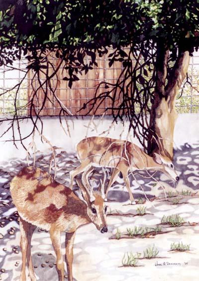
    "WHITE TAILED DEER"--20"x28" original Watercolor Painting by Vera Dennen

    So almost a week has flown away, and with it my determination to blog at least three times a week. Have to admit right here and now that it never will happen!!!

    But I do want to continue my look into gray. An artist friend of mine, after recently reading Set 1 on gray, had this to say . . .
    “...I find I use grey more and more as I understand it better and I too used to avoid it! Ha! Maybe now with grey hair and everything else happening, we have made friends with the color!” I think she may have a point. And what is really so strange is that gray is no big mystery at all: mix any variation or intensity of the three primary colors and you will have produced some shade of gray. What took it so long to sink in?

    The nonstaining triad is one of my favorites. Aureolin, rose madder genuine, and cobalt blue can be combined in equal amounts of altering proportions of each. Grays made with these pigments will have a great transparent, luminous quality, perfect for glazes. You can create wonderful atmospheric effects in your paintings without creating a heavy background, or modify the intensity of an underlying color. Try adding a small amount of any fourth pigment with this transparent blend. For example, make your fourth addition a small amount of brighter pigment you plan to use in the painting--the mixture that would normally be discarded as muddy can now be used to accentuate that much brighter hue.

    Predictably, the mixing of the staining triad will work in reverse; Winsor yellow, Winsor red, and Winsor blue can also be mixed to make gray (along with any other combination of staining primary’s). These neutrals dry lighter and with less intensity than they would appear to have as wet pigment, so be careful when first becoming acquainted. They are wonderful for use as middle values, but tend to take over completely if used as a glaze. You can mix your own version of Payne’s Gray, Sepia, etc. with the staining triad, so be aware and do not plan to use this gray in any way you would not use a deeper toned premix.

    And finally, we come to opaque. Yellow, Indian Red, Cerulean Blue are some examples of the opaque triad that you might use, although there are certainly others. An opaque neutral, although being made-up of pigments I normally do not find beneficial, takes on a richness and consistency that is especially useful while a broad assortment of darks can be produced. I find myself mixing a batch of opaque gray for use in landscapes, animal fur, and places I will be adding short, quick brush stokes such as building rocks or rocky terrain. However, large areas of this triad can quickly be overdone, appearing muddy, or boring in scope.

    So there you go! Neutrals can be a lifesaver if you become aware of individual properties and where they are weak. In the painting above, “White Tailed Deer”, I have extensively used several triad mixtures to my advantage: an opaque triad in the trees, with non-staining pigments on the ground as a glaze, and another neutral for highlighting fur. There may be a fourth combination mixed in there somewhere as well, I don’t quite remember, but I do remember having fun . . .

    * Artist's, if you would like to receive a list of pigment properties for mixing a varity of triad's, please contact me through my web site. I will happy to sent one in return.

    5/7/05

    Installment#4:THE COLOR OF GRAY-Set 1

    TEXT IS COPYRIGHT PROTECTED

    When in the very early stages of painting, certain revelations about color begin to gel in ones brain. Of course you hear painting terms being kicked around by your peers that at first have little meaning. For instance, it took me the longest time to realize what glaze meant, and how it would affect the over-all composition. While many terms are fairly straightforward, such as a wash, wet-into-wet, even hard and soft lines, others seem truly elusive, at least for me . . . another of these mysterious words was the term muddy.

    At last I realized that wash and glaze were almost the same thing, except that a wash went down first as it “washed” across the paper, adding color. While a glaze went on second, over the wash, in order to “glaze” select areas only, changing top and bottom colors together into a third. Wow, what a concept, simple, easy to grasp, and all connected with adding an attractive and varied assortment of shades, tints, and hue!

    The same can be said for hard and soft lines, fairly uncomplicated, easily recognized on paper, and enormously helpful when mastered. Much simpler than color!

    As an example, did you know that there are blue-blacks, and red-blacks, just as there are blue-reds and orange-reds, and that’s just for starters! Confused the heck out of me! And to make matters worse, any combination of red, yellow, and blue (called a Triad) happening to meet on your paper will produce an off-shade of gray known as muddy. Since this is to be avoided at all costs, somehow it was much further down the road before the benefits of mixing useable shades of gray, or an assortment of neutral hues, came to light.

    This was a real breakthrough in my development, and gray began to make sense.

    5/4/05

    Off Subject: BLACK MOOD!

    IMAGE AND TEXT ARE BOTH COPYRIGHT PROTECTED


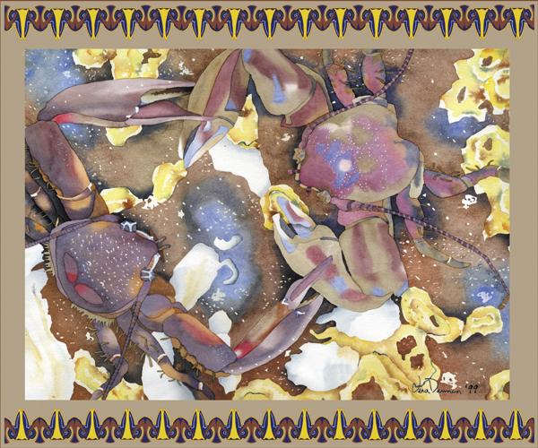
    "TWO'S A CROWD"--18"x22" Original Watercolor Painting by Vera Dennen

    Oh my gosh, I feel as if I am being pushed and pulled by my Art, with all kinds of tuggings trying to force more directions than I want to go.

    Gracious! In case you have not discovered this for yourselves just yet, other artists can be such ninny’s sometimes. Apparently there is only so much of the "pie" to go around . . . meaning of course sales. Kind of like the Porcelain Crabs in above imaged painting . . . each fighting for a small stretch of beach.

    Oh well, this too shall pass. And it is almost a new day!!!

    5/2/05

    Installment#3:THE ROLE OF YOUR MUSE

    IMAGE AND TEXT ARE BOTH COPYRIGHT PROTECTED


    "TOWN & COUNTRY"--lithograph w/ graphic border (original watercolor 14"x21"--SOLD)

    According to Webster the definition for muse is: a source of inspiration, which is any of the nine sister Goddesses of learning and the arts in Greek Mythology. Webster seems very sure the number is indeed nine! Well, I have never read that particular Greek Myth, but I would swear there truly were only three. Heckle, Jackal, and Hide, not necessarily in that order.

    Oh? I see, you thought your Muse would be the tender hand holding type, having a never ending supply of solutions designed to keep you encouraged, and your career moving forward. Yeah, right! No. No, but please don’t get me wrong! The fact that your Muse is much more likely to be a slave-driving wretch, who will make you bleed for every step forward you gain, is not entirely their fault. In fact, the fault does not belong to the Muse Sisterhood at all, but is rather embedded in the true nature of man (or woman, whichever applies). You see, owing to our own highly competitive nature, humans do not respond as well to kind the word of advice as one would suppose.

    Think about it. Does a toddler refrain from climbing just because loving parents have repeated some seventy million times that their angel will fall and go boom? No, of course not! The toddler will continue to climb. And, until they have experienced a really good goose egg on their own terms, words will be totally wasted. Even then, just to make sure that the “boom” really had been as bad as they’d thought, the toddler will do it again.